The Hotspot component is an interactive CMS component we created at Dotdash Meredith for using within stunning bespoke sponsored pages. Our goal was to make this component as customizable as possible, with any features our design team could think to use, so they could utilize their skills without feeling the burden of constraints that often come with designing within the confines of a CMS.
Hotspot Buttons
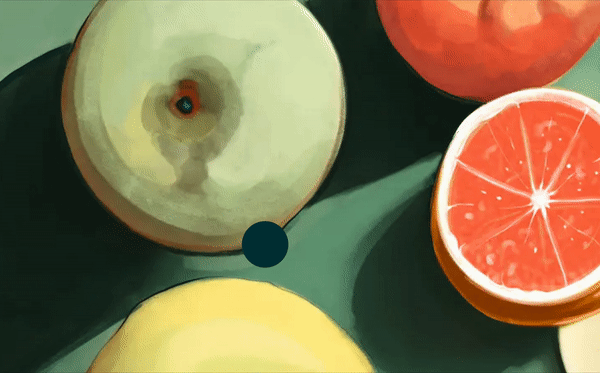
Subtle hotspot animations indicate to the user that the page can be interacted with.
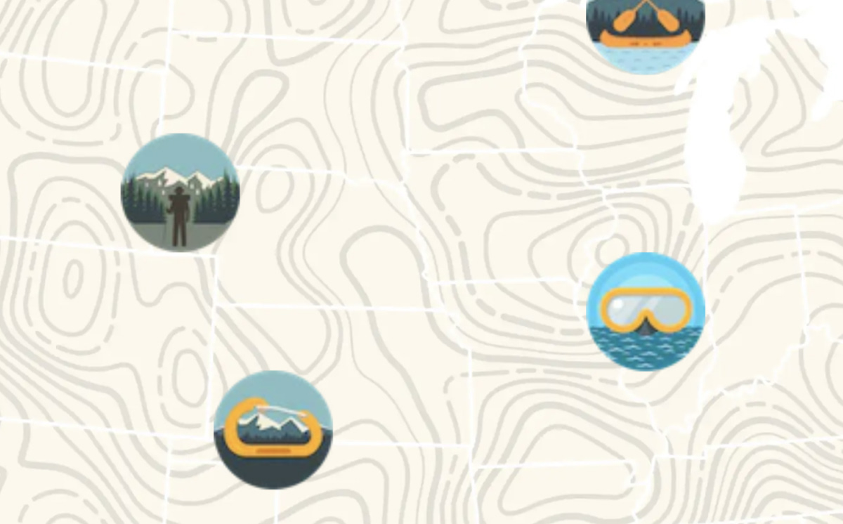
We added the option to override the default hotspot circles with custom hotspot icons.
Lightbox Options
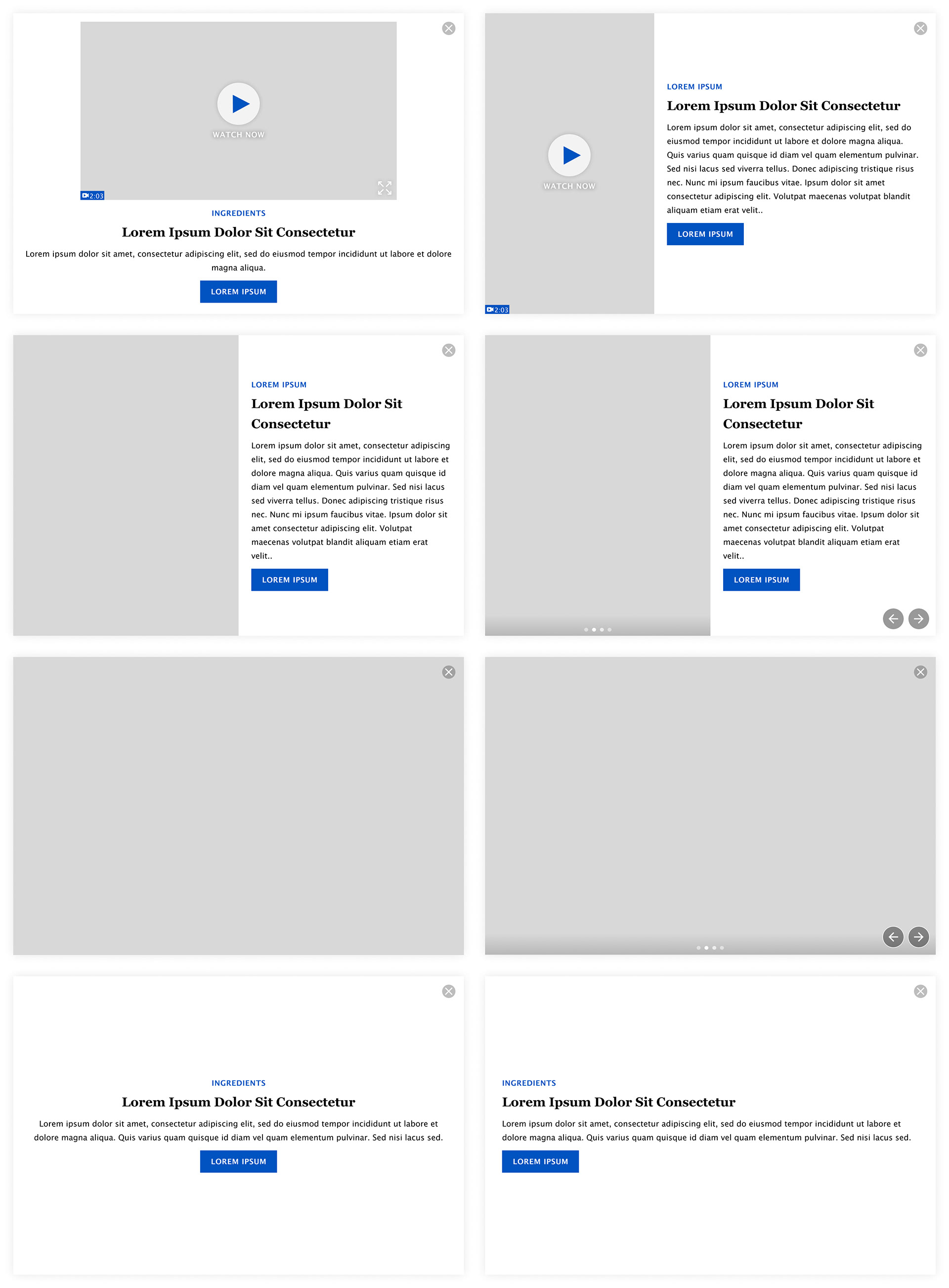
In order to maximize what this component could do, we wanted to incorporate as many lightbox capabilities as possible. This included video (16:9 and 9:16), text with image, image only, and text only lightboxes. The image and text with image options we also made available in carousel form.
The colors of the elements within each lightbox is fully customizable as well.
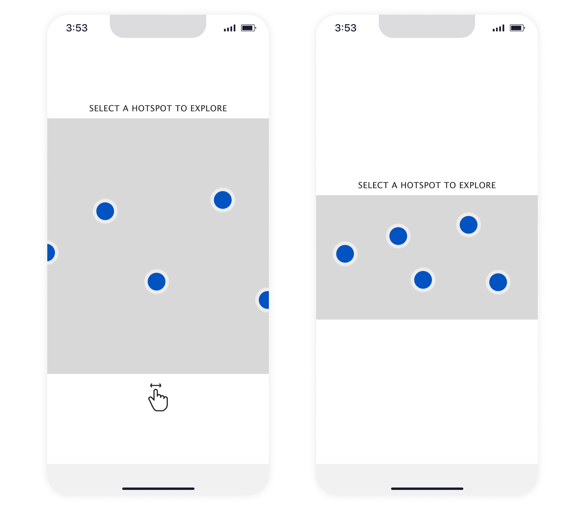
Mobile Options
On mobile screens, there is the option to set the hotspot image to be full bleed or be extended past the edges of the screen and allow for panning.
The panning option is great for times it is easiest to use the same image for desktop and mobile. The full bleed image works well for times when a separate custom mobile hotspot image is made (especially since this image can be any height).