Some background:
Californians Against Waste pushes legislation that aims to make the world more sustainable and less wasteful. They promote composting, purchasing fewer plastic products and products within plastic packaging, recycling responsibly, etc.
The existing name, Californians Against Waste, was limiting in terms of location, and in order to give the brand more potential for expansion, a rename seemed necessary. The new name Eliminate World Waste (EWW for short) allows for a broader audience.
You might be thinking, "EWW, what a horrible acronym". Well, there's a reason for it.
Nearly all Americans agree that recycling is important and saves the planet, however most of the people that consistency recycle are 35 years and older. EWW hopes to target the people who do already care about the environment but may not be doing very much about it. EWW also hopes to spread importance of their cause to the younger generations who may not be taking as much action as those above the age of 35. This age needs to be focused on as they will continue to influence generations to come.
So, with Eliminate World Waste's quirky acronym, EWW, we have created the potential to appeal to this younger audience through satirical advertisements and campaigns. Keep scrolling to see what we mean.
Social media campaign against waste:
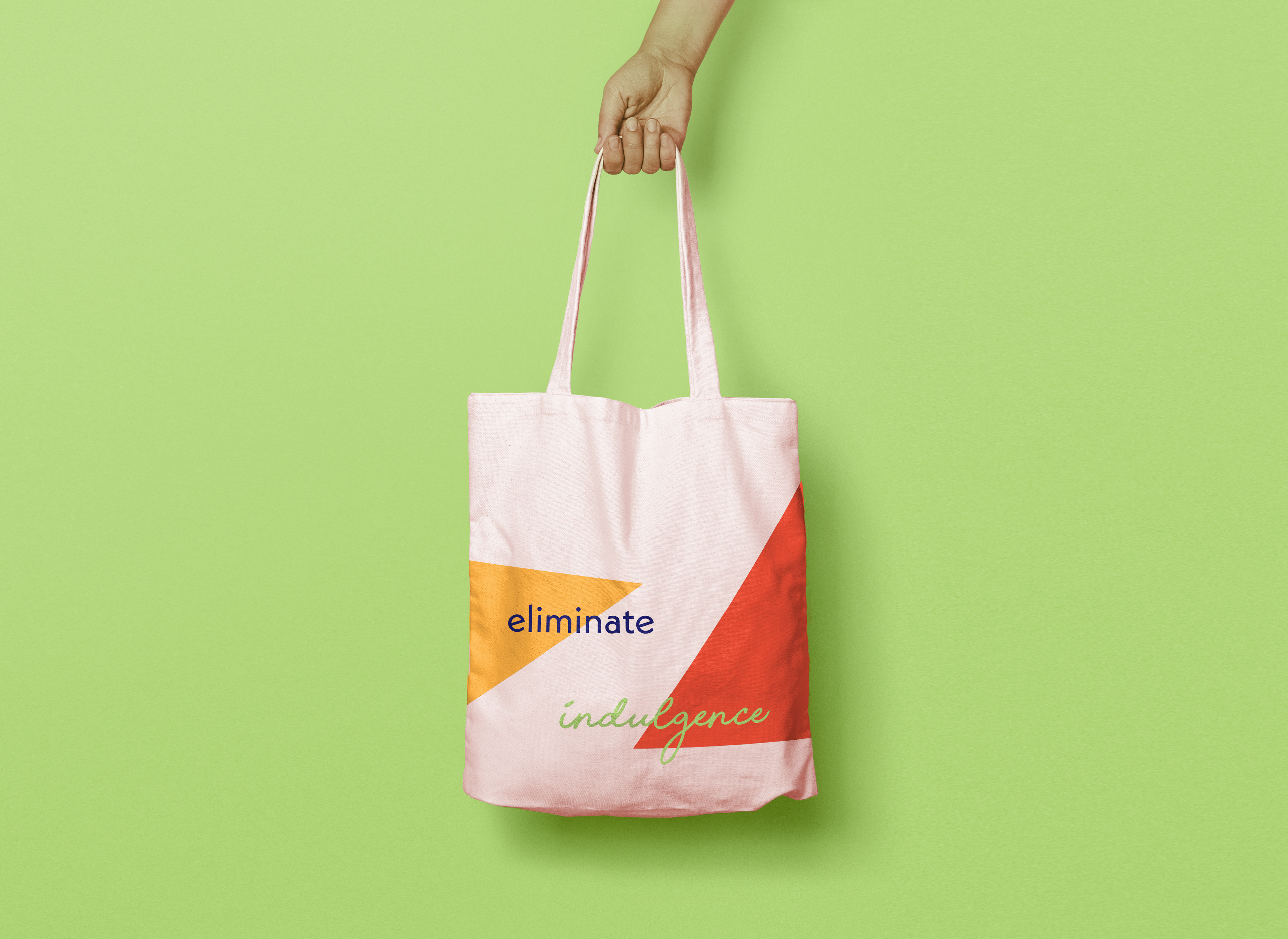
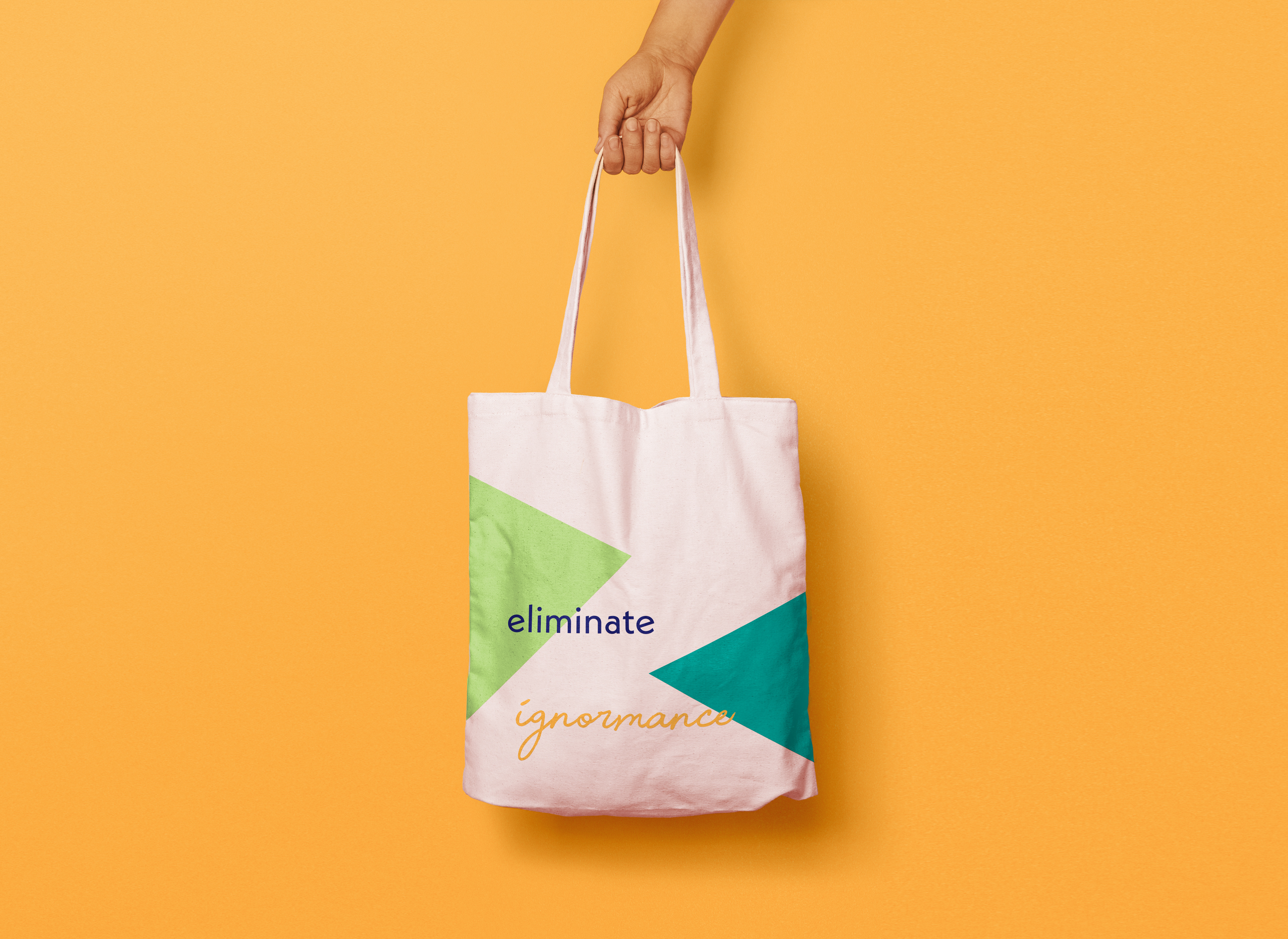
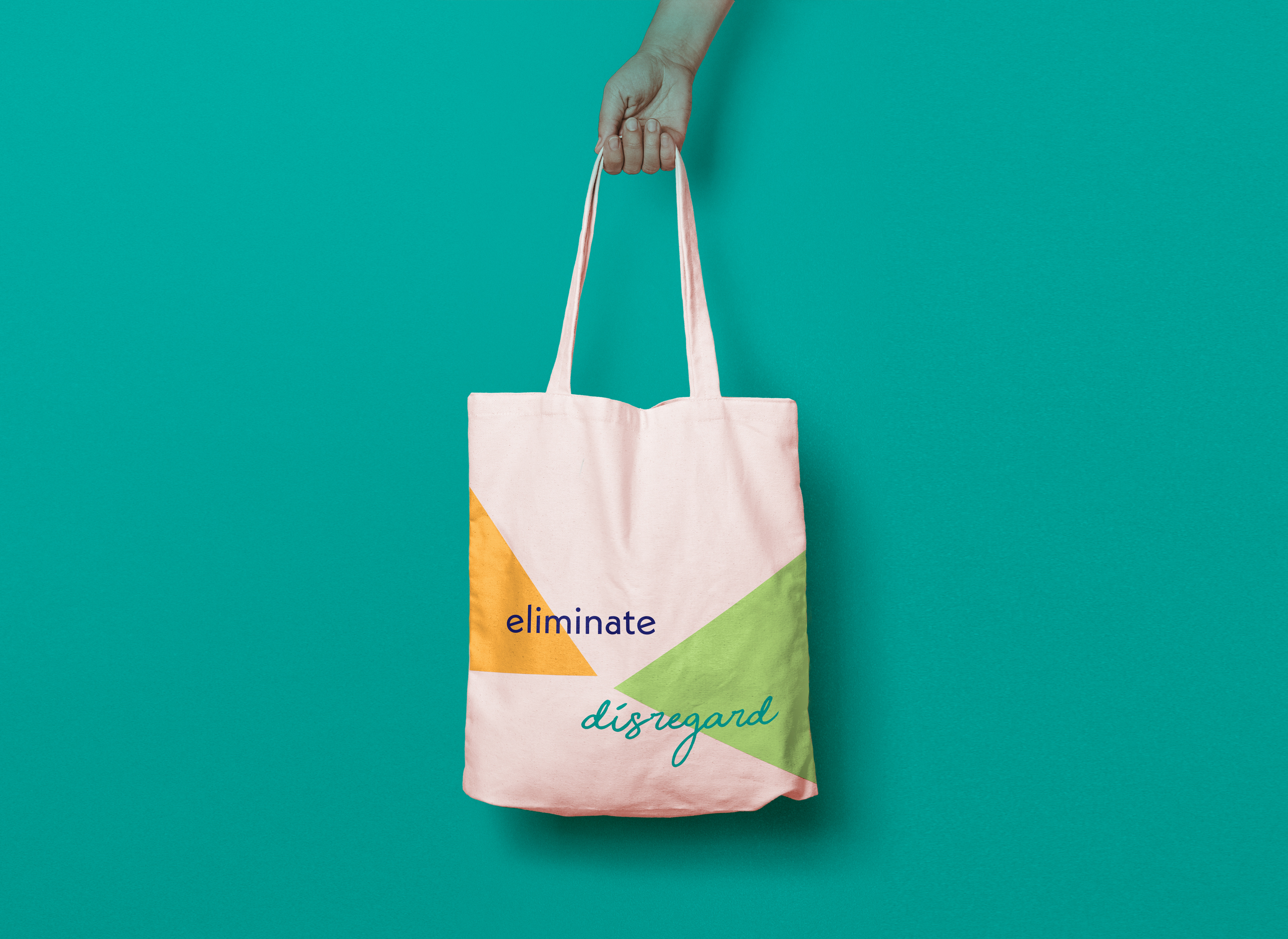
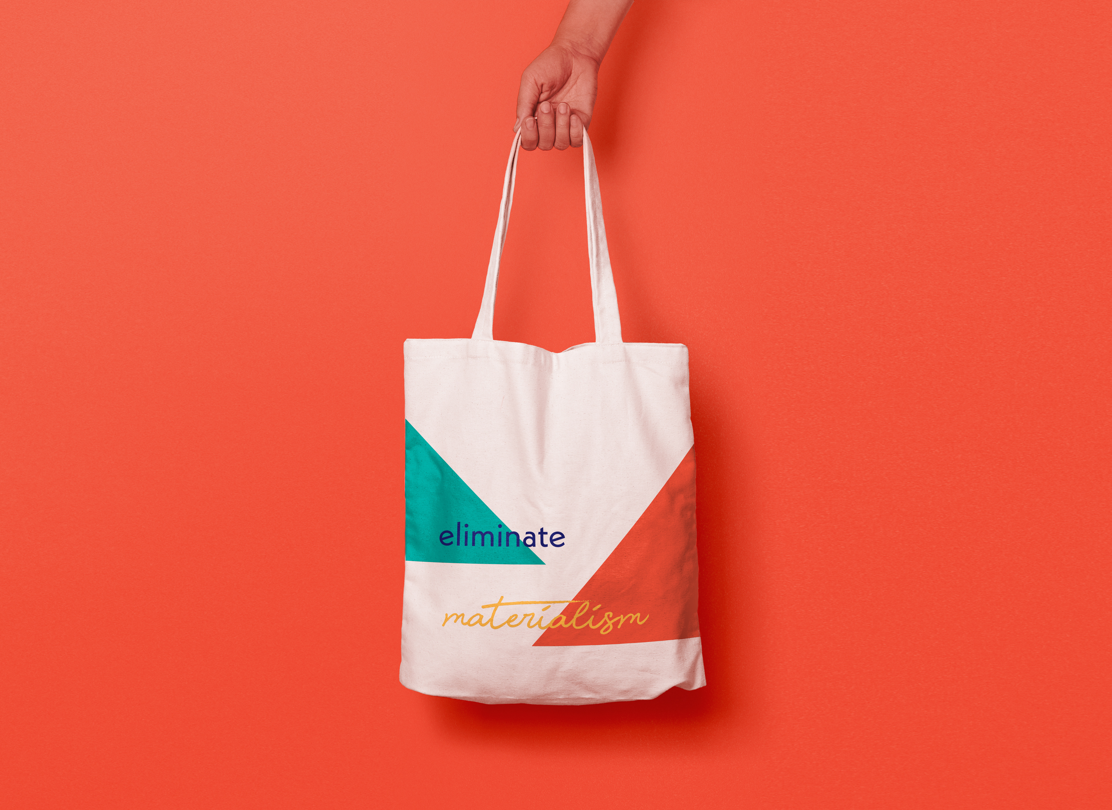
Reusable Canvas Bags
EWW isn't just about eliminating waste. It's about eliminating all the negative attitudes that come with wastefulness too. We created this reusable grocery bag not only for practicality and to reduce plastic bag use, but to remind our audience to eliminate disregard for the earth, materialism apathy and so many other negative traits and mindsets.


Fleeting Poster Installation
EWW itself aims to produce as little waste as possible, and that includes through the promotion of the brand. So to spread the word about waste reduction though something other than digital media while not producing significant waste, we decided to have pop-up biodegradable poster installations. The beauty of these temporary posters is that they show viewers first hand the power of using eco-friendly products while creating minimal amounts of waste. As soon as a rain storm comes by no trace of the posters will be left, so why should our waste last for centuries?
Website Redesign
I decided to keep the website condensed into three main pages. Pages on the original website that were once separate (about and contact, legislation and issues) were easily combined. I removed the page dedicated to donation and put it front and center on the home page. This helped eliminate redundancies and excess confusion.
On EWW's original website, the pages with current issues and legislation information was too text heavy and extensive. I took inspiration from news websites to create organized sections of information to replace the long scrolling blocks of text and make the information more easily consumable.
Before we get into the details... here are some of the ideas that didn't make it:
One of the biggest realizations was that EWW had to stay away clichés. So many environmentally forward brands use greens and blues, and imagery like globes and recycling symbols. A simple "e", however didn't necessarily provide any information about what EWW does. The three color logo had too many colors, and removed some of the important recognizability of a simple one or two color logo.
In the end, a simple mark that worked both as an elimination symbol and the letter "e" worked best.
Eliminate World Waste Brand Guidelines:
Brands design when left unmonitored can sometimes become a mess. Logos get used in ways they weren't originally intended. Imagery and typography can become inconstant. This brand guideline is meant to guide any future designers of EWW so that the vision for the brand stays constant and impactful.