At Dotdash Meredith, we have a set of components we use for sponsored content, one the most used being the hero component. We wanted to improve this hero, making it more flexible, while keeping it turnkey and usable for both basic article pages and more premium articles. This is what we ended up with:
How it Began
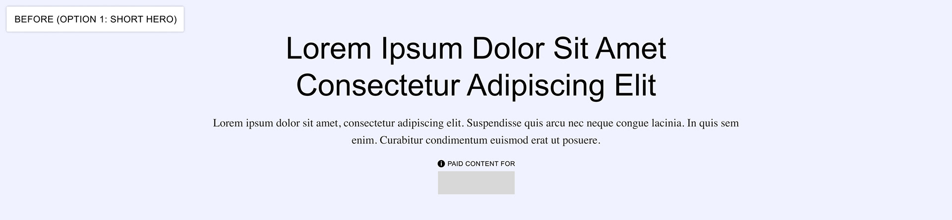
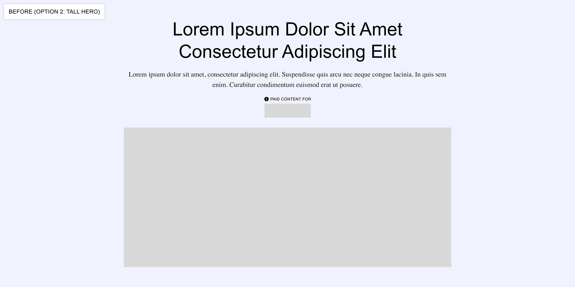
Our old hero consisted of several parts: the background (this could be a color or an image upload), the header, sub-header, sponsor logo and a foreground image. Each of these pieces were optional. Having no image uploads would result in a shorter hero, while uploading an image to either the background or foreground image areas would cause the hero to fill the viewport.
Our goal was to take the hero below and make it more flexible, while keeping it turnkey and usable for both basic article pages and more premium articles.
Problem #1
The background image and foreground images of the old hero had set dimensions that were fairly restrictive to designers.
The hero was also set to fill the viewport whenever any image was uploaded. Having this be the case meant that the designer had very little control over what areas of the the background image might be cropped during browser scaling and that the background image could not be used to house any important imagery or information.
The hero was also set to fill the viewport whenever any image was uploaded. Having this be the case meant that the designer had very little control over what areas of the the background image might be cropped during browser scaling and that the background image could not be used to house any important imagery or information.
Solution #1
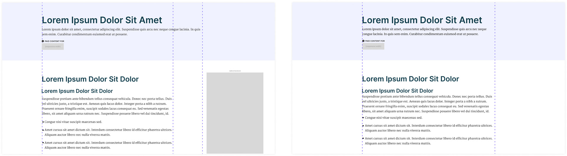
Making sure there were distinct upload options for desktop, tablet and mobile means that the designer can now have more precise control of what shows at what screen widths.
We removed the odd viewport filling logic and replaced it with a "fill viewport" toggle option. We also allowed for a flexible height image upload for both the foreground and background image, so that if “fill viewport” was set to “false” the hero’s height would be determined by height of the contents within the hero (Though if “fill viewport” was set to “true” and the contents exceeded the height of the viewport, the hero would not be restrained to the size of the viewport to keep the hero from breaking or cutting off content).
We removed the odd viewport filling logic and replaced it with a "fill viewport" toggle option. We also allowed for a flexible height image upload for both the foreground and background image, so that if “fill viewport” was set to “false” the hero’s height would be determined by height of the contents within the hero (Though if “fill viewport” was set to “true” and the contents exceeded the height of the viewport, the hero would not be restrained to the size of the viewport to keep the hero from breaking or cutting off content).
Problem #2
There was no option to left align content in the old hero, and the solution wasn't as simple as add a left aligned rich text option (the sponsor logo would remain centered and the text would not always align to properly match the article body paragraphs). Headers that were always centered tended to look particularly odd on standard article pages with no hero background and a more visible misalignment with the article body.
Solution #2
We added the option the have hero content centered or left aligned. This option would also move the sponsor logo and adjust the margins depending on what made sense with the rest of the page.
Ultimate Flexibility
In addition to those adjustments, we also added the capability to move the header, sub-header, sponsor and foreground image in any order. We also added the option to change the width of the foreground image to be full bleed.
For instances when a designer wants full creative control and chooses to have custom header treatment within the image upload instead of using live text, we made sure to include a field to add the header (set to not display) for accessibility and search purposes.
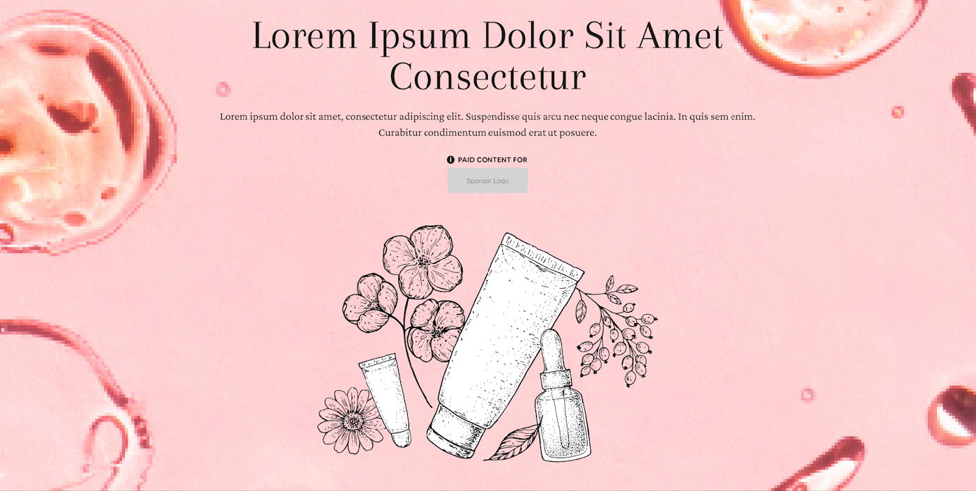
How Our Design Team Used This Hero

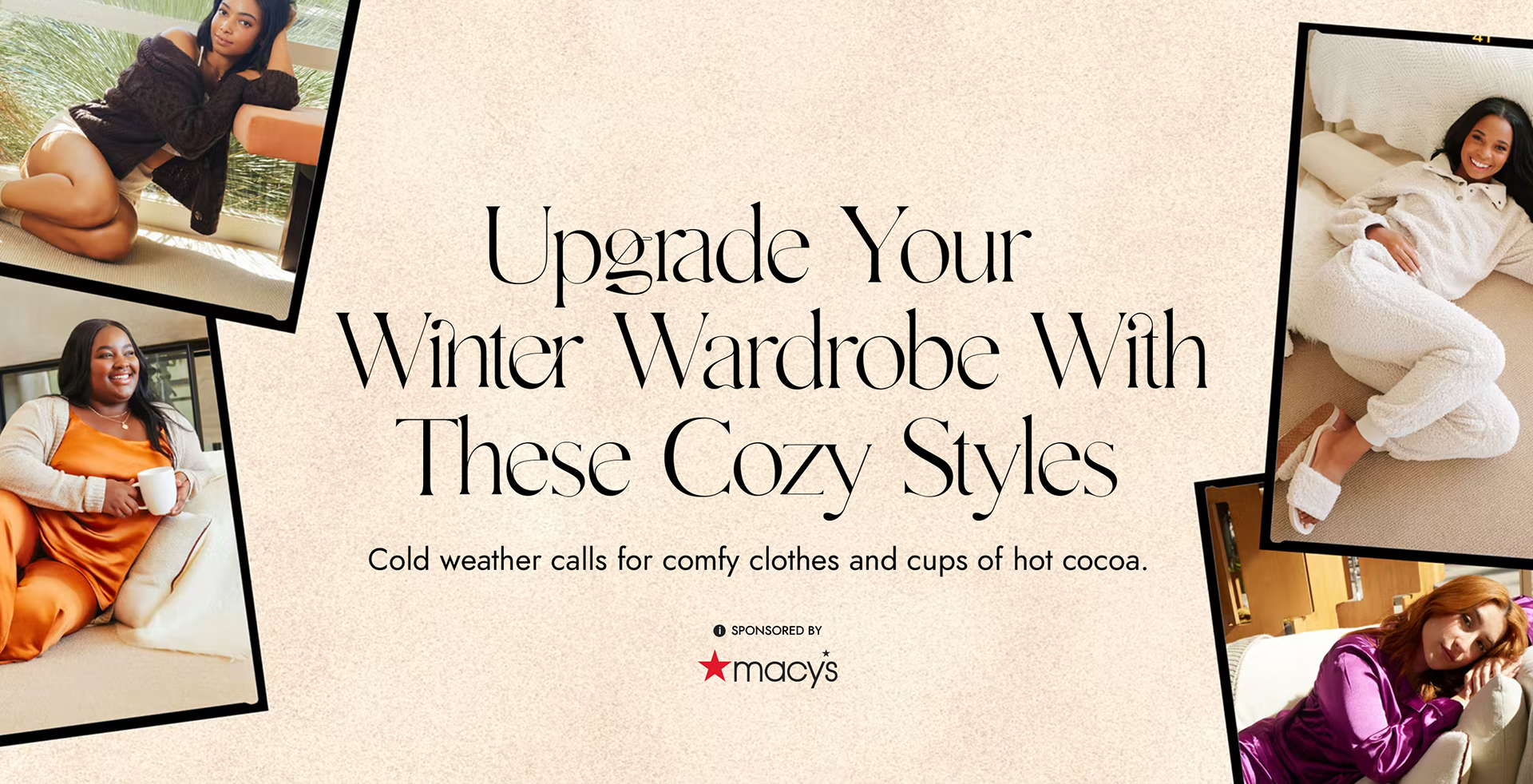
Visit live page here (Design by Ellie Kantor)
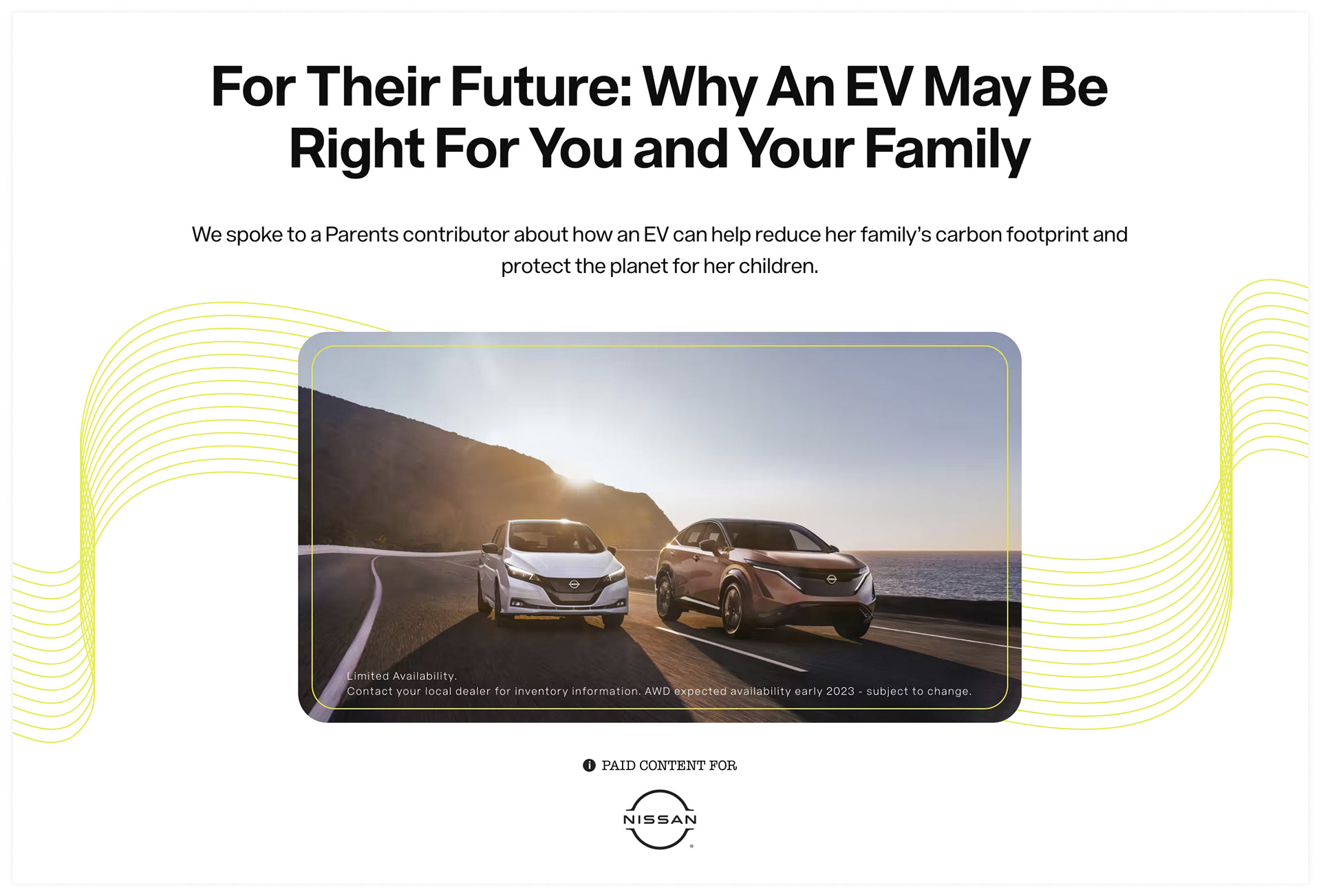
Visit live page here

Visit live page here (Design by Ellie Kantor)
Visit live page here (Design by Ellie Kantor)

Visit live page here